Category Archives: review

Review: Conan the Barbarian #20

Brian Wood had a promising start to his Conan run with Queen of the Black Coast. The first three issues stayed remarkably close to Robert E. Howard‘s original story, and the next three established the tone of Conan’s future adventures with Bêlit. However, everything past those first three issues has been new material written by Wood, instead of adapting anything from Howard. Admittedly, Howard’s Queen of the Black Coast isn’t long enough to fill 25 issues, but Wood’s original stories have been somewhat hit-or-miss. I enjoyed most of them, with a few exceptions. You can read my earlier reviews of this series for more details, but I think Black Stones is turning out to be one of those exceptions.

But before I get to what I didn’t like, I’ll talk about what this issue does right: the artwork. As in the previous issue, the artwork is done by Paul Azaceta and the colors by Dave Stewart. But in issue #19, there wasn’t a lot going on visually; in issue #20 Azaceta gets a chance to show off his unique style with a haunting full-page image, a few action sequences, and even some ancient magic. 

The artwork is great, but I can’t say the same for the story in this issue. It picks up with Conan and Bêlit fleeing from a fanatical cult after stealing a precious relic from them. They fight with the cult members a few times, then Bêlit accidentally finds out what the relic is for in the first place. I won’t spoil any more than that, but I find myself wondering what the point of this adventure is. After all, there’s only one more issue for Black Stones to conclude. I was almost worried that Brian Wood’s Conan run wouldn’t end by adapting the last half of Howard’s original Queen of the Black Coast, but then I saw the cover of (spoilers in the link) issue #22, and now I can’t wait for that issue. 

But what I’m trying to say is that Black Stones just seems like a story to fill issues until the finale. At the end of the current issue, the story takes an unusual turn, and I’m not sure how that will resolve into a meaningful plot point in just the next issue. So far, Black Stones has just been Conan and Bêlit investigating, then fighting against this cult, and it doesn’t seem to have much significance in the bigger picture, aside from perhaps the magic that we see used at the end of this issue. Brian Wood’s Conan stories have always been about the relationship between Conan and Bêlit, but Black Stones hasn’t added or changed much between the two of them. Will the next issue prove me wrong? Maybe, but I have the suspicion that the end of this story arc will feel forced or just weak, like the story about the impostor in Volume 14: the Death

I hope that won’t be the case, but the first two issues of Black Stones haven’t been very promising. Still, if you’ve been keeping up with Conan, this issue is worth the cover price of $3.50 just for Paul Azaceta’s artwork. If that doesn’t interest you, I have higher hopes for the upcoming Song of Bêlit. Brian Wood’s start to Queen of the Black Coast was excellent, and I’m really hoping that the end will be too. 

Danilo Culibrk, aka Augustus, is a staff writer for the Red Shirt Crew. He’s played enough D&D to know you should never open ancient relics just to see what happens. You can follow his trail through the Forest of Ghouls on Twitter at @Augustusing.

Review: Dream Thief #5

I always have trouble assessing endings, which is probably related to the difficulty of writing endings. Trying to take something that otherwise had momentum from one installment to another and ending it in a satisfying way is really difficult, and I don’t begrudge anyone the difficulty in doing so. Unfortunately, for something that I’ve been so enthusiastic about so far, Dream Thief #5 (written by Jai Nitz, illustrated by Greg Smallwood) leaves me a little mixed with how it wraps the series up.

Like I said with the end of the last issue, they changed the way that the issues had typically ended up to that point. We’d always seen John right after he wakes up from a murderous rampage, but in that issue, it ended right before he was knocked unconscious and went on one of said rampages. I really liked the change of pace, and this picks up logically from that point. The problem is, it gets confusing rather quickly, and I had some difficulty with following exactly what was going on and why. Part of this is directly caused by that change of pace – while it was a welcome change, it also completely threw me off and I spent a lot of the issue trying to catch up with what was happening.

You’re definitely going to want to reread the previous issues before picking this up. So much from the early issues is referenced, so once I went back and read those, everything came together and clicked in such a way that wrapping up the story actually became pretty satisfying, if still somewhat disjointed. My one problem, and maybe it’s just me, comes from one element of the story that wasn’t set up well and always feels like a cheap way to tell a story. It doesn’t ruin it and I don’t want to spoil it, but it has nagged at me consistently since I read it.

Greg Smallwood continues to be really good, but I don’t want to talk about his art here. Instead, I’m going to talk about the last few pages of the issue, after the editorial page. For each issue (and these better be compiled for the trade), they include other artists’ interpretations of the characters and various scenes at the very end. I’ve quite enjoyed seeing those, especially since you often get locked into a specific look and feel for a character during a specific artist’s run on a comic, and seeing all of these reminds me of how much of an impact the artist and their style has on a character – it isn’t quite the John Lincoln I’m familiar with, and getting that reminder when I’m such a writing-oriented reader is something I need, along with a really interesting extra feature that most comics would never really feature.

Overall, my recommendation is simple. If you liked the previous issues, you’ll want to see the end and it’ll be worth your $3.99 to get there, even though it doesn’t quite feel like the rest. If you haven’t been interested, there’s nothing groundbreaking here that’ll bring you in. If you’re on the fence, you might want to wait for the trade to come out (they announce on the editorial page that it’s coming out March 12, 2014, though I’ve seen no official confirmation from Dark Horse). Regardless of that, I’m a little mixed, but I think I need to give it some time to sink in before I really pass judgment on how it ends (maybe I’ll revisit it when the trade comes out).

Zac Kandell (known mostly on the internet as Mischlings) wants to like endings, but finds that he oddly likes the perpetual middle. If you find what he says interesting, follow him on Twitter at @Mischlings for more, shorter thoughts.

Review: Buffy the Vampire Slayer Season Nine #25

It shouldn’t be a secret that I’ve not been a fan of this series. Quite recently, I said that I just wanted it to end so I could see if Season Ten would be an improvement. Having just finished Buffy the Vampire Slayer Season Nine #25 (written by Andrew Chambliss, illustrated by Georges Jeanty) I don’t even have that optimism anymore. No, it’s not completely dead in the water and it would be possible for them to right the ship again, as shown by the awesome series that was Angel & Faith, but they don’t leave me with much confidence.

The problem is, I can’t tell you why I’m so frustrated with this issue. It’s the polar opposite of Angel & Faith #22 in that, while everything that affected me is a spoiler, they’re all in a bad way. Like that issue, I’m going to have to be very oblique here – I may do something like I did there and spoil the hell out of it in a later article because, well, this kind of needs it. It makes almost all the mistakes that Angel & Faith avoided, and I know I’m spending a lot of time comparing the two, but they set themselves up for it by publishing the two concurrently and putting out the finale of one before the other.

When I got to the end of this issue, I felt like the majority of the season was wasting time, which I already suspected but hoped they’d be better than. With one huge exception, which has a laundry list of its own problems, things haven’t really changed from the status quo at the beginning of the season. I can’t even say that it’s needed for the sake of continuity, so there’s not even that going for it.

That big exception? Can’t talk about it here, and all I do is shake my head at how dumb it is. More on that some other time.

One of the reasons that I hate how badly this book affects me is the art. I quite enjoy Georges Jeanty’s art, and it’s not at fault for what’s wrong with the series. He’s been drawing this series and these characters since 2007 now, and it shows. There’s really nothing new here anymore, so if you liked his art earlier in this series or even in Season Eight (he didn’t draw all of it, but a lot of it), you’ve already seen just about everything and it’s only improved since.

I wish I liked this more. I wish I could recommend this issue at all, but unless you’re a completionist who was already going to buy this anyway, don’t. I love Buffy, kind of obsessed really, and even I’m going to wait until I can get the trade for $10 instead of paying $2.99 for an issue. It’s just not even worth it. I can hope that Season Ten is better and I’m not giving up on that, but I’m glad this is done and afraid of what the future might hold.

Zac Kandell (known mostly on the internet as Mischlings) will admit that Christos Gage taking over the main Buffy series in Season Ten would change his mind in a second, but knows better than to hope too much. If you find what he says interesting, follow him on Twitter at @Mischlings for more, shorter thoughts. Occasionally.

Review: The Star Wars #1

Yes, The Star Wars #1 (written by J. W. Rinzler, illustrated by Mike Mayhew) is a Star Wars book. I’m not sure how to fit it into the Expanded Universe canon, if that’s even possible or necessary to. None of that matters, however, and I recommend that anyone who has even a passing interest in the concept pick it up: this is based on the original screenplay that George Lucas wrote in 1974, before many of the changes that made Star Wars what it eventually became.

This is why I say it’s not important to try and figure out how it fits into the canon – call it an alternate universe or something else, just take the concept and run with it. While I’d prefer the franchise in general to completely leave behind the Skywalker family, this is a good way to approach it. A lot of the things that you’re familiar with are gone (and I tried looking for them – they’re either gone or we’re just not there yet), so just take the basic ideas of how the Star Wars Universe works and run with it. It’s difficult to say what’s different because of spoiler limitations, but even knowing that this was based on a completely different version of the movie, I was surprised by how different it was.

A big difference that caught me off-guard was the different entry point into the universe. I expected an opening on Tattooine with Luke, or maybe even the actual opening to the movie with R2-D2 and C-3PO on the Tantive IV. Instead, it starts by going more behind the scenes of the rebellion going on when the original movie started. It serves the purpose of showing the actual events in the opening crawl that Star Wars made famous instead of just using said opening crawl, which may be a rather controversial decision depending on the fans you ask. Don’t worry about its complete absence, though – there is a half-page text crawl setting up the universe at the beginning as if you were completely unfamiliar with it, which applies to very few people but still is a nice touch.

I’m not entirely decided on the art style in this book. As I lack a good art background, I’m not entirely sure how to describe it, but there’s something about the way that faces are drawn that bugs me somewhat. They just look slightly off, but it could just be that it’s a stylistic choice that I won’t even notice after a couple issues have passed, it’s just something worth notice.

Overall, I recommend picking up this book. I know that I haven’t gone into too many specifics, but I don’t think you really need it at this point. It’s a really interesting idea to use the old draft of the script, especially when so many things from that script have been the “what might have been” about the series for decades, that I think just starting to see what it’s becoming is worth the $3.99 cover price. So long as you know that you probably won’t get exactly what you’re expecting, you’ll probably enjoy it.

Zac Kandell (known mostly on the internet as Mischlings) now has something else to add to his pull list. Somehow, getting free comics is really expensive. If you find what he says interesting, follow him on Twitter at @Mischlings for more, shorter thoughts.

Review: Catalyst Comix #3

With Amala’s Blade and Angel & Faith having recently ended, Catalyst Comix is now the Dark Horse comic that I look most forward to each month (well, maybe on par with Dream Thief, which also will end soon), which I consider high praise since about one quarter of it has gone right over my head the entire time. While I have my issues with it, let’s see what Catalyst Comix #3 (written by Joe Casey, illustrated by Dan McDaid, Ulises Farinas, and Paul Maybury) has in store.

When the last issue ended, I had no idea where they were going to take Frank Wells and his story. Things went in a really different direction than I had expected given the rather explosive beginning in the first issue, but now I’m seeing where that actually goes, and I really like it. I’m not going to tell you what it is because it’s something you need to discover as you read. It’s not something new at all to comics, so don’t expect the reinvention of comics as an art form, but it’s a change in direction to almost the polar opposite of how it started that they somehow manage to pull off. They’re not too heavy handed or awkwardly trying to shove a character where they don’t fit – they spent almost two issues making sure this transition happened smoothly. It doesn’t all work perfectly, as there’s a subplot that feels like it should mean something to me but I don’t understand, but it’s only a couple pages in an otherwise really good story.

The Grace storyline is finally starting to click. I’m still not entirely sure I follow all of it, but a new character was introduced that made it feel like things were finally starting to move forward. This character, Seaver, seems like someone of significance to the universe before the recent reboot, but regardless of that, he serves as some form of opposition to Grace. With his presence, there’s finally some sort of conflict which was missing before, and the story feels like it’s finally going somewhere.

Then, on to the section with my favorite name, Wolfhunter and Elvis Warmaker, more correctly known as Agents of Change (and no, I don’t think I will ever get tired of this gag). For all the improvement to Grace’s storyline, this one is starting to lose me, so apparently there has to be at least one storyline in each issue that I don’t quite get. I don’t know exactly what I was expecting from the end of the previous issue, but they don’t go there and it throws me off badly. It doesn’t ignore the reveal, but it’s much less important than the end of the last issue would make you believe. For that reason, the story ends up being more confusing and disorienting than anything else, which is a disappointment for a segment I’ve loved so much so far.

I continue to really enjoy the art. Frank Wells’s story has a lot of different locations and styles blended together flawlessly, helping greatly to keep the tone from feeling jarring throughout. Grace continues to have really interestingly designed locations, and her adversary Seaver has, while a little cliche, a well-done design that is just mildly off-putting. Nothing jumped out at me in the other series this time, but I still love the design of the characters – while it’s not new, that doesn’t mean it’s not good.

All things said, I still definitely recommend this book. I’ve absolutely loved the Frank Wells story from the beginning and I think that alone is worth $2.99, which I still can’t believe is the price for issues in this series. Grace’s story is starting to pick up, and I haven’t given up on Wolfhunter and Elvis Warmaker (not after one bad issue, since Grace’s story went through two), so there’s plenty of interesting stuff going on in this series still.

Zac Kandell (known mostly on the internet as Mischlings) is mildly disappointed in his buddies with the amazing names. If you find what he says interesting, follow him on Twitter at @Mischlings for more, shorter thoughts.

Review: Baltimore – the Infernal Train #1

Lord Henry Baltimore takes a detour from his hunt for the ancient vampire Haigus in the newest issue of his adventures: the Infernal Train #1. For those unfamiliar with Baltimore, it’s a comic written by Mike Mignola and Christopher Golden, with art by Ben Stenbeck and colors by Dave Stewart. If that’s not enough to interest you, it’s about a British nobleman taking revenge on a vampire in an alternate timeline where World War I ended two years early because of the outbreak of a vampire plague. And if even that’s not enough, you can read these two reviews of earlier Baltimore comics by MaristPlayBoy.

One of the strengths of Baltimore has always been world-building, and that’s apparent from the first pages of this issue as Baltimore arrives in Budapest by steamship, sailing between the pillars of a ruined bridge that once led to the abandoned part of the city, and disembarking in the busy harbor on the other side of the river as the sun sets in the distance.

The next several pages show even more details about Baltimore’s world, showing how people deal with this new plague in much the same way as they did with the Black Death in the Middle Ages. Mignola, Golden, and Stenbeck go to great lengths to make this version of Budapest seem like a real place. People celebrate in the streets and go on with their business in the midst of the plague, and what’s left of the city almost seems safe. Until nightfall, that is.

I won’t say too much about the events of this issue, but there are two things I should mention. In the Plague Ships, a few panels hinted at the character that seems to be at the center of the mystery surrounding the Infernal Train. The device that makes “fire without smoke” was only briefly mentioned then, but it looks like there will finally be answers about that in the issues to come. Also, Judge Duvic is back, and Baltimore’s not running away this time.

But this story would be nowhere without Ben Stenbeck’s excellent artwork. If Baltimore’s world is believable, it’s only because his lines and deep shadows make it so. This series wouldn’t be the same without his characters and landscapes. The monsters are gruesome, the empty streets are foreboding, and Baltimore’s grim resolve is almost palpable.

If you’re already keeping up with Baltimore, you probably don’t need me to tell you that this issue is well worth the $3.50 cover price. If you’re new to this series, this issue doesn’t ask you to know too much backstory, but the Plague Ships and the comics that follow are definitely worth a read. If you’ve enjoyed anything by Mignola, Golden, or Stenbeck in the past, you shouldn’t skip Baltimore.

Danilo Culibrk, aka Augustus, is a staff writer for the Red Shirt Crew. He won’t tolerate any distractions from his quest for revenge… but he might make an exception for chocolate. You can follow his rides on the Infernal Train on Twitter at @Augustusing.

Review: Captain Midnight #2

I find it quite difficult to keep reviewing this series. I was hopeful at first that there would be something to make this not feel like Captain America (take a shot), but the more that it goes on, the less hope I have for that. Captain Midnight #2 (written by Joshua Williamson, illustrated by Fernando Dagnino) is making me regret the initial enthusiasm I had for the series, which I want to be good but just isn’t.

This issue starts off with Captain Midnight getting the back story to Fury Shark that we already knew. It’s not the greatest start to an issue – even his reaction to it adds nothing new to anything (pseudo-Captain America (take a shot) thinks that having a Nazi be a prominent figure in the United States is scandalous? You don’t say!), so we start off on a redundant foot already. I almost feel like it’s there to try and introduce the character to people who are just picking up the series in this issue, but that’s not a good enough excuse for it to be so clumsy. It’s a great idea if they pull it off without the clumsiness, since most comics don’t do enough to try and get new readers in without backtracking, but it’s still not well done.

The worst part is that they just end up seeming to copy Captain America (take a shot) in far too many ways. I understood it early on, when it worked as a way to get me into what the character is basically all about, but it’s starting to get ridiculous at this point. Displaced in time from World War II? Okay, sure, you can tell a different enough story from the same premise. He’s not just a soldier, but also somewhat of a technology expert? Interesting and different – they stretch it with him being able to work modern technology in minutes and being able to improve on it, but I can take that. His love interest from the war being an old woman now who still misses him? I’ll take that – unless you want her to have died and cut off story possibilities, you’ll have to do that. Have her remarkably similar looking granddaughter find and befriend him as some sort of government/military agent and hint towards starting some sort of relationship going that way? Take more than just a shot. They’ve gone past just trying to set up the premise – now is the time for you to show me what’s so different from him that I want to read this instead of Captain America, not continue to bring out all those similarities.

The art is, well, the art. I kind of had my expectations set high by the #0 issue, which while not having the most inventive art overall, had a visual gag that I absolutely loved. Somehow, the series has lost the sense of humor already (or it’s just the fact that neither of the artists for that issue continued on to the next issues), and I’m left to just look at the art itself. The thing that sticks out to me is Fury Shark, who is shown in a firefight wearing a leather bodysuit that, while obviously showing off her breasts, makes her stomach look like it was drawn by Rob Liefeld. Okay, that may be a slight exaggeration, but the costume looks like it was designed for a muscular man, then thinned down and had breasts added. Did I mention she had high heels as well? In the middle of a firefight? This is just confusing me at this point. It’s 20 years too late to try and bring back a character in the 1990s style, especially in a way this confusing. It’s not like bringing 1990s characters back in the current style — that’s working pretty well so far elsewhere.

I don’t recommend this issue, in case I left any doubt in your mind. I thought that there was potential back in the #0 issue, but it’s not lived up to it and doesn’t feel like it’s going to any time soon. There are better books out there to spend $2.99 on until and unless this one starts to live up to its potential. It’s not even a spectacular, interesting to tear apart failure – just a mediocre book that doesn’t do anything interesting. I might pick it up again in a while to see if it’s gotten better, but for now, I’m not even interested enough to keep reading for the time being.

Zac Kandell (known mostly on the internet as Mischlings) had fun tearing this issue apart, but unless it becomes a different kind of bad soon, there’s nothing left to say. If you find what he says interesting, follow him on Twitter at @Mischlings for more, shorter thoughts.

Review: King Conan – The Hour of the Dragon #4

I should apologize that in my previous reviews of this series, I never mentioned the excellent cover art by Gerald Parel. I’ll try to make up for that here. The cover of King Conan: the Hour of the Dragon #4 shows Conan fighting a giant wolf. It’s pretty awesome, and in a perfect world, that would be all you need to know about this issue. Unfortunately, the comic only features a wolf that’s slightly larger than average, certainly not big enough to hold a man in its jaws. Still, the rest of the issue is great. The last issue ended with King Conan riding off into the sunset to reclaim his kingdom, and in this one we finally get to see what’s happened in Aquilonia because of his absence. This issue introduces several new characters and sets up challenges for the Cimmerian, left “a king without a kingdom” after the battle at Valkia.

There’s some action in this issue, but for the most part it gives us backstory and informs events to come in the next few issues. Issue #3 ended without much direction, so it makes sense that this issue introduces some new events, but there are several new characters as well. This makes the story a bit more complex, but there are only eight issues left to tell it. I’ve said it before, but I’m still worried that this adaptation of Robert E. Howard’s Hour of the Dragon will lose a lot by being compressed into so few issues. There’s not much room for pause in this series; events fly past in just a few pages, but Timothy Truman does manage to highlight the most important parts of the story.

In this issue, the focus is once again on Conan dealing with magic, as well as political struggles. On one hand, there are at least three sorcerers trying to influence the outcome of his quest. On the other, the rival nobles of Aquilonia threaten to split the kingdom. King Conan has a lot to deal with before he can make good on his promise to return for Zenobia, but he’s faced worse before. At least this time, he might find allies in the loyal nobles of Aquilonia. Speaking of Zenobia, she, Tarascus and Xaltotun show up only once in this issue. They’re all still important, but I have a feeling we won’t be seeing much of them for the next couple of issues.

The artwork and colors are just as good as I’ve come to expect from Tomás Giorello and José Villarrubia. Like the previous issues, the artwork is dark and evocative. Giorello’s work always gives these comics a unique atmosphere, and this one is no different. 

If you’ve enjoyed this series so far, King Conan: The Hour of the Dragon #4 is definitely worth the $3.50 cover price. Sure, it doesn’t have the giant wolf that the cover promises, but you won’t want to miss this issue if you’ve been following the story. I just hope that the rest of the story fits in the relatively few issues remaining. This series is already one-third of the way done, but it still feels like the story’s just beginning. 

Danilo Culibrk, aka Augustus, is a staff writer for the Red Shirt Crew. He thinks all comics should have giant wolves on the cover. You can use sorcerous powers to follow him through the eyes of a raven on Twitter at @Augustusing.

Review: The Strain: The Fall #2

For those of you that read my first review, just know that this one won’t be much better. Needless to say they filled in some plot-holes that came up from the first comic, but it still leaves a lot to be desired. There are certain things I understand cannot be changed at this point plot wise, and credit where it’s due, the authors (Guillermo Del Toro & Chuck Hogan as read on cover) do their best to handle that. The main issue I have at this point is continuity, and style of writing. Otherwise it seems that the second verse is the same as the first in many ways.

As with the first comic, the story looks at many “vampire cliches” without using (what I think are) actual vampires. All this was explained in my previous review, but the plot cliches seen here are a bit different, or at least modified from the ones seen earlier. For example, there’s the age old “elder vampires” punishing those who “lost control” coupled on with the “recruitment of a slayer” to kill for the elders. Put that with the savage tribe in the sewers and the rouge who wants to overcome his affliction and you have your choice of supernatural stories to read before bed. It’s not a bad thing; cliches are used because they work, but not all at the same time.

Another thing I don’t get is why there are still new characters being introduced. I know they got to keep it fresh, but its like they said “lets ignore the 90% of character that didn’t work and throw in some new ones”. The lack of focus on any one character really hurt the first comic for me, but since they didn’t even bother to bring most of them back, I don’t see why I should have cared for any of them, or why I need to care about any of the new ones. Will the bring the original cast back later? or was it just a sentimental anecdote to set the mood for the real story? I have no way of telling. The way that the characters are being over-looked its making it hard to get enthralled in the plot.

The issues I have with this comic are the same as it’s predecessor, and I am unimpressed with the sequel. Similarly, I will give it “would not recommend” because as a series, I don’t see an interest. If you wanted to get into it, you could easily start on this one and ignore the first one, but overall, don’t waste your time, or your $3.99, not until something redeeming comes out.

Bigmacd101 (I’m talking anywhere and everywhere) finally feels like a real red shirt when, for the first time, a comic was reserved for him! Now beware of personal projects (pending approval) coming up, he hopes, soon. Until then, this review has his stamp and he hopes to get some new followers (@bigmacd101… or real life if you know what I look like).

Review: Willow Wonderland TPB

After Buffy Season Eight took four years to end, Season Nine took a different approach, being made up of multiple miniseries running concurrently. In theory, this was a great idea, allowing them to cover more ground in a shorter amount of time, allowing each series to feel more focused than the sometimes schizophrenic Season Eight, and giving nostalgic fans a sense of similarity to Buffy and Angel airing concurrently on TV. Of course, this idea only works as well as the individual series themselves, so how exactly does Willow-Wonderland (written by Jeff Parker and Christos Gage, illustrated by Brian Ching) stand up on its own merits?

I previously mentioned my general dislike for this miniseries, though I didn’t go into much detail and was slightly off on how I remembered it (in my defense, it had been a little while since I’d read it). The biggest thing that I mentioned was the problem with the way that Willow talked; she’s not just an incredibly powerful, mystical witch, she’s also a woman in her mid-20s who grew up in California in the late 1990s. I’d said that second element was missing from her character, but it wasn’t entirely accurate to say that. Both of those elements are there – except that they’re separate. She seems to go back and forth between mystical goddess and Season One Willow (remember that, from all that time ago?) without any real in between. It seems to get better as the series progresses, coinciding with, no surprise, when Christos Gage joins in the third issue. It causes the story to get off on a bad foot and leaves a bad impression that lasts the rest of the series.


The next problem, however, cannot be fixed by better dialogue or characterization. The story, while not as bad as I remembered (and plugging a couple of plot holes in the last issues of Season Nine), is chaotic and has almost no attention span. Willow goes from being focused on bringing magic back to Earth to joining some magical lesbian orgy coven, to trying to deal with her dark side (which I thought she dealt with between Seasons Six and Seven, when she was reunited with everyone early in Season Seven, again at the end of Season Seven, and probably even more times), and it just keeps on going in what feels more like a series of events than a really cohesive story. Willow on a quest to bring back magic could’ve easily been the only story going on here with everything serving that purpose, but it seems to get lost in the chaotic events surrounding her and the supporting characters.

Let’s talk about those supporting characters, starting with Aluwyn, Willow’s love interest. Willow’s love interests have had a track record of not being liked when they’re introduced, mostly because they weren’t the character people wanted to Willow to be with, but Aluwyn really takes the cake with this. She’s a trickster demon witch who pretended to be Willow’s spiritual guide during astral projection, then later sent Buffy to the far future where she was forced to kill future Dark Willow, and told Willow that she could bring her back but couldn’t look at what was going on in the future, probably making sure that Willow wouldn’t realize how badly she could go dark and ensuring that she would, causing the bad future. While Willow doesn’t realize all of this, she knows most of it and should know that Aluwyn shouldn’t be trusted, yet we’re supposed to believe that the two of them are deeply in love and that we should want them to be together. Aluwyn continues to deceive Willow openly in this series, and yet that never really changes. We’re supposed to be supportive of a relationship that is absolutely terrible for Willow, yet she never realizes it? It’s like the writers never learned anything from Kennedy in Season Seven, since they keep making the same mistakes over and over again.

The other supporting character to focus on is Marrak. I’m going to overlook the fact that he is rather single-minded in his search for power, since while it takes away some of the possible layers to his character, he’s supposed to serve as a foil to Willow. Having a simpler character serve as a foil is actually a help over the short term, so I don’t mind that he’s like that. The problem is that he’s a character that we already know (spoiler warning): Rack, Willow’s magic drug dealer. It’s not just the fact that this is reminding me of one of the more clumsily handled storylines from the show, but it’s a continuing trend that points towards a much larger problem. By bringing this character back, we’re washing away the tangible consequences of Willow’s rampage at the end of Season Six. It almost feels like they’re trying to protect Willow from herself, which brings up the ultimate problem with this series.

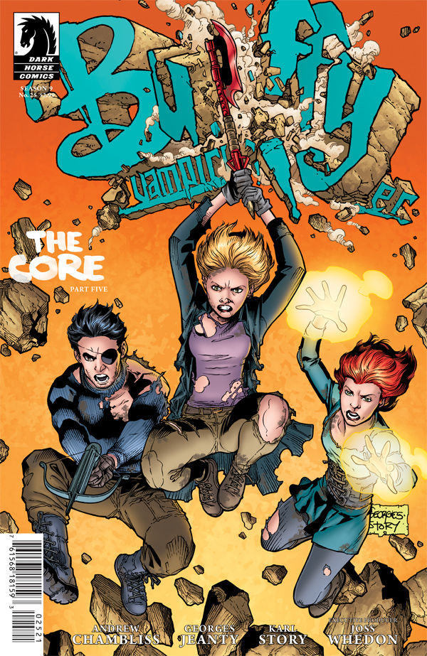
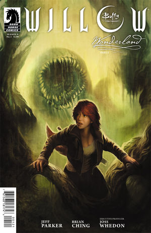
Willow Wonderland #1 Variant Cover

This story is absolutely in love with Willow. It’s not that I don’t like Willow or think that she’s a good character. I like Willow, but they’re presenting her as some sort of perfect human being. The best part of Willow’s character is that she’s extremely flawed — her girlfriend’s death caused her to go on a rampage where she killed two people rather gruesomely and attempted to destroy the entire world before she was stopped by a yellow crayon, all of this coming from the rather naive wallflower we were introduced to in Season One. She’s so interesting because of that, not because she’s some sort of really powerful, perfect witch. It’s like the worst kind of fanfiction white-washing of a character, taking an interesting, complex, and flawed character and reducing her to a caricature of the “cool” part of her character (incredibly powerful witch, sexy lesbian). Even in its attempt to try and point out that her dark side is just a part of her and not a separate persona, they end up making her seem a little too perfect and like that’s a phase that’s behind her now.

For a complete sense of whiplash, I absolutely love the art, both interior and cover. There are a lot of new characters with interesting designs, all of which were designed to be as strange and different from each other as possible. Plus, almost the entire series is set in alternate dimensions meaning that there are many interesting looking locations. Then there’s the cover art. Megan Lara drew the variant covers, which tended to be less stylized and closer to reality (her issue #1 cover looks almost like a photograph of Alyson Hannigan), but everyone pays attention to David Mack‘s covers. Honestly, they’re the best thing about this series. They’re highly stylized but focus on Willow’s mystical side, and there’s nothing more I can say about them, you just need to see them to get what’s so special about them. Unfortunately, outside of his cover for issue #5, they’re all buried in the book, so if you want to see and display the covers, you’ll want to find the single issues more than the trade paperback.

I also need to mention the “special features”, one of the main things that draws me into trade paperbacks. There are a ton of sketches and concept art, showing the evolution of the new designs and the thinking that went into them. There was obviously a lot of work that went into developing the design of everything from Willow’s clothing (which I wasn’t a huge fan of, but that’s a small thing) to the witches in the supercoven. I honestly feel a little bad for Brian Ching having put all this work into the design of characters that weren’t served well by the story and characterization.

Ultimately, I don’t think that this is worth paying $17.99 for. If you really like the art, then buy the single issues so the cover art can actually be displayed. The story does plug some of the plot holes in the end of the Buffy series, but unfortunately the rest of the plot doesn’t really hold itself together as a standalone series.

Zac Kandell (known mostly on the internet as Mischlings) is demoralized by this and the imminent end of Angel & Faith with no news about Season Ten in sight. If you find what he says interesting, follow him on Twitter at @Mischlings for more, shorter thoughts.